
Agents copy whatever they see most
With coding agents writing screens, a design system’s first job is to give them one version to copy. Igor Varyvoda created Sirv AI Studio in December 2025 and built most of it. In February he moved its interface to shadcn. The product grew fast, which was the right call for a new product, but by March the components had drifted: edited classes, convenience wrappers, variants inside primitives and global CSS overriding component styles.
Each local change made upstream updates harder, and it taught the agents the wrong lesson. An agent writing a new screen copies the pattern it sees most often, so every drifted copy produced more copies.
On 5–7 March I took ownership of the shared UI and reset it in one branch. A script fetched 33 components from the official shadcn registry. A codemod rewrote 167 tooltip usages in 63 files. Global overrides went away, and the customizations worth keeping moved out of the primitives into documented places. Igor added hooks and a skill that held the agents to the canonical components, fixed the violations they turned up, merged the branch and fixed the tests the migration broke.
By May the kit had outgrown its starting point, and I asked whether it was worth making reusable:
It’s already better than default shadcn, and heavily refined in places. And there would be one place to make fixes, with a Storybook.
Six minutes later it had a name, Sid-Kit. That day it became a package inside Studio, and the next day Sparta, the B2B platform I was building, moved onto it too.
Nobody picks a color
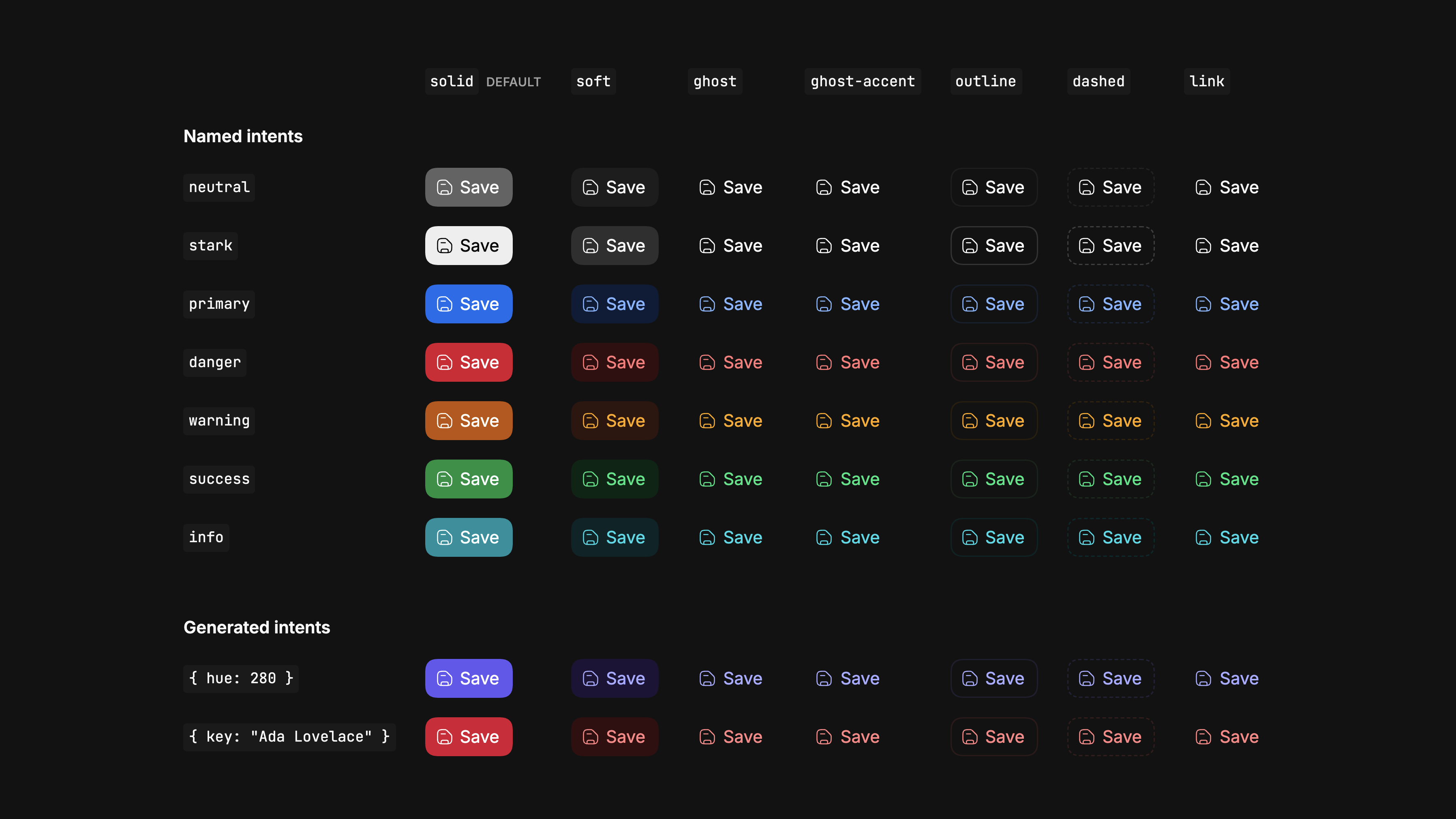
Sid-Kit components never name a color. They paint with roles, so a list of categories gets consistent colors in both themes without anyone choosing them. Data-heavy products need a lot of meaningful color, a status per order or a badge per category, and a palette picked by hand works in one theme and fails in the other.
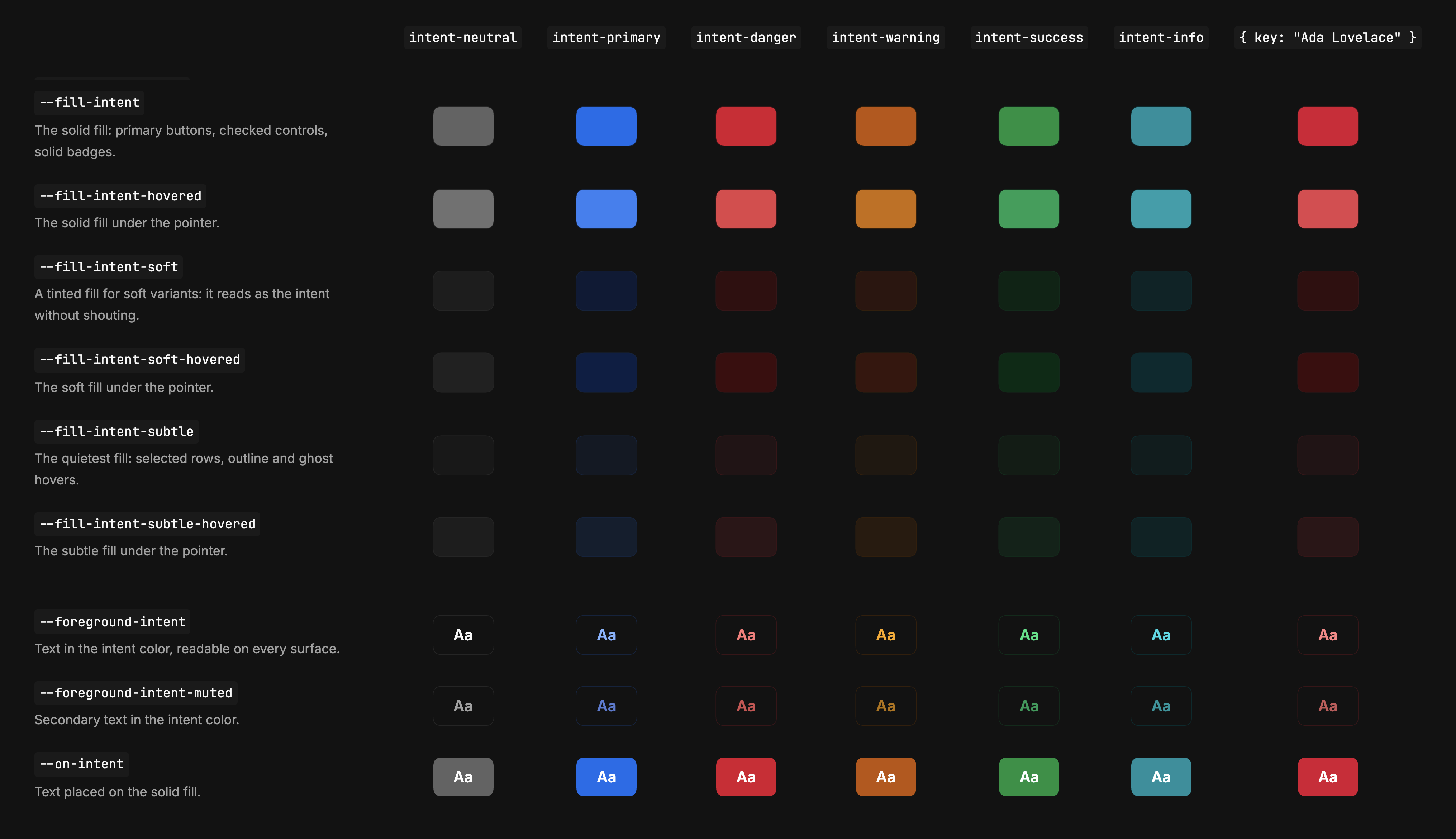
A role is a job: the solid fill of a primary button, a soft fill, the quietest fill of a selected row, text in the intent’s color, muted text, text placed on the fill, borders in four strengths, each with its hover state. Every role exists for every intent. The named intents are neutral, stark, primary, danger, warning, success and info, and any other can be generated from a hue or from a key such as a customer’s name.
Every color is a formula in one file
Since September every color in Sid-Kit comes from one specification of OKLCH seeds and formulas, about 460 lines, and the move changed nothing a user could see. It started on 23 September, with a list of token names on my screen:
I see an inconsistency in how our tokens are named. Card intent has the intent at the end, but then it’s intent soft, intent subtle. What do you think about how our intents are named, how they’re applied as modifiers, and how it should be?
The next day I asked Claude to analyze the naming and the formulas behind it, and gave its plan to Codex for review. Codex confirmed the collisions and the diverging formulas, backed a single source and doubted that cutting public tokens was justified. It also named the trap that would shape the cascade: CSS computes a derived color where it is defined and children inherit the result, so a coefficient changed on a child recomputes nothing. I made three calls: “Make foreground neutral an alias of foreground. Get rid of legacy completely. Leave contrast for now.” For the rest I said plainly that I didn’t know how risky it was or how much of my attention it needed, so the plan had to prove itself.
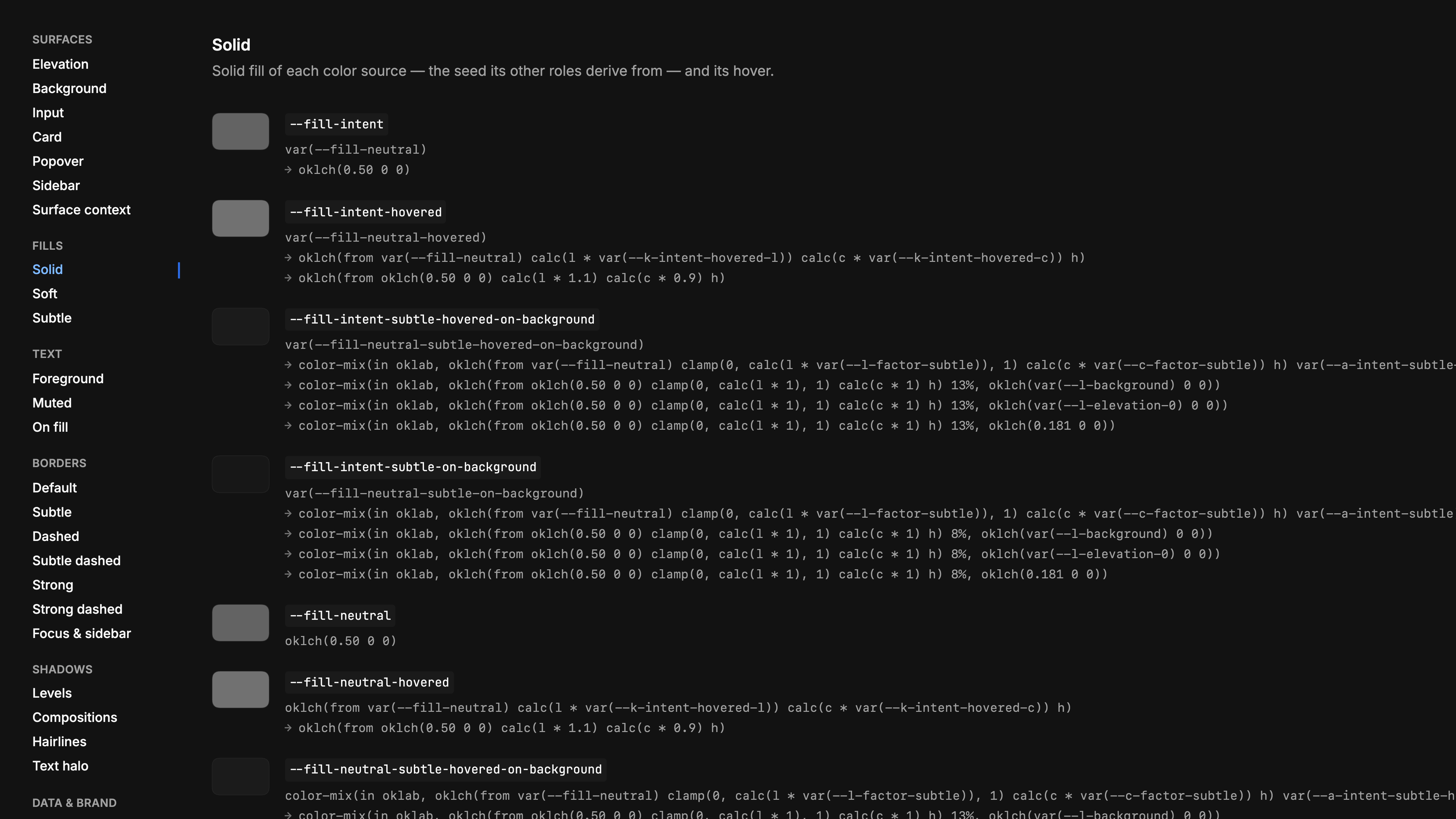
It did. A build step generates the token stylesheet of more than 3,000 lines, the Tailwind bridge and the typed intent roles from the specification, and fails if they are stale. When the specification replaced the hand-written palette, every resolved value stayed identical in all 534 contexts checked. The old names went the same evening, as a breaking change, with a script that rewrites consumers.
Most tokens are formulas rather than values. A hovered fill is the fill with its lightness and chroma scaled by two named coefficients, so changing a coefficient moves every hover state at once. The catalog’s Raw Variables page reads the same stylesheet and expands each definition one var() at a time, down to the numbers the browser computes, so it can’t drift from the components.
Intent flows down the tree
An intent is not a property of one component. Set it on any container, and the roles inside resolve against it: text, dividers, fields, badges and buttons all follow. A component without its own intent takes its container’s; one with an intent keeps it. Since 0.35 that is the default for every primitive, and a grey look has to be asked for with an explicit neutral intent.
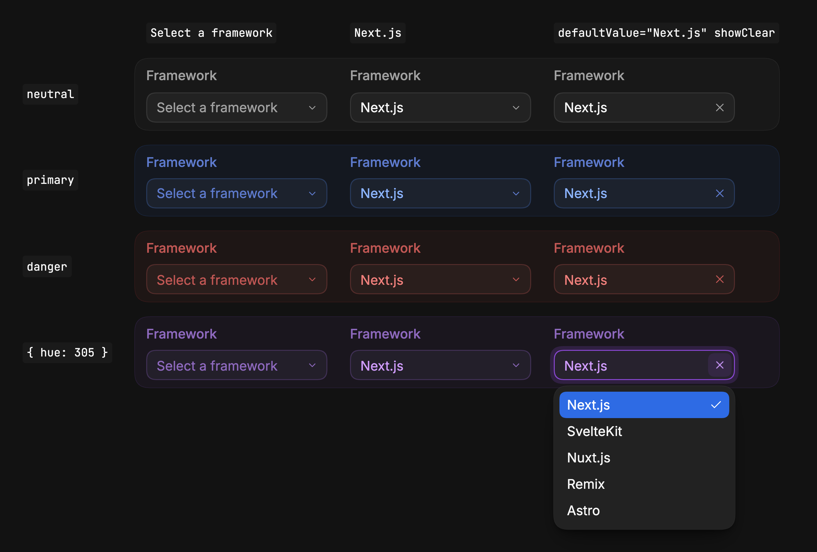
Nothing in the card below names a color either. The markup is identical in all six; only the container’s intent and the theme change.
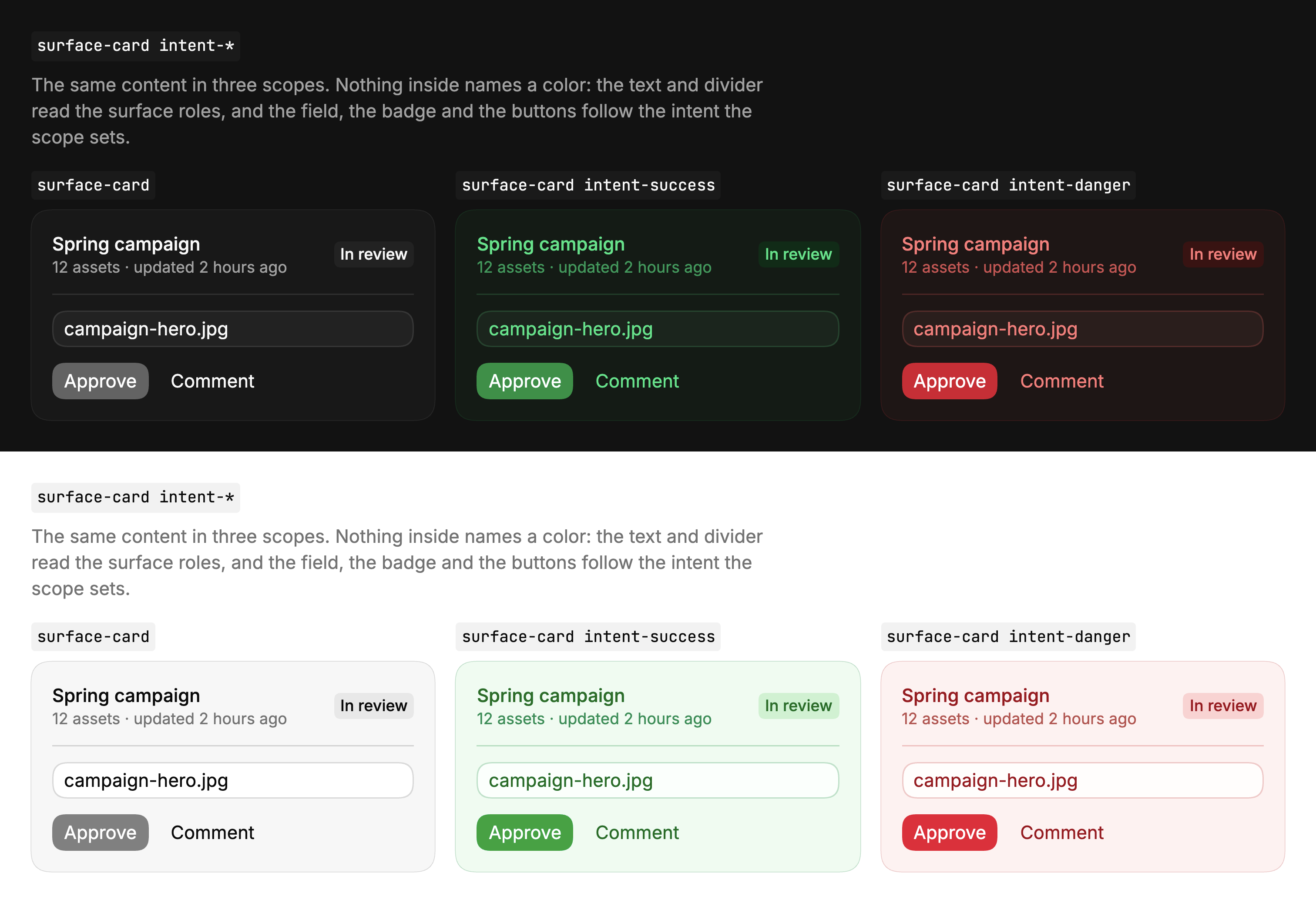
It is ordinary CSS inheritance, and it has the price Codex warned about. A token derived from an inherited one would freeze the parent’s value, so every scope recomputes its dependent tokens locally, and a test fails if a scope forgets one. And because inheritance does not cross a React portal, the content of a popover or menu is handed its scope explicitly.
A card works out its own depth
A card should look raised on a page, and a card inside it raised on the card. In most systems someone picks a grey for each case. In Sid-Kit, elevation is a CSS context from 0 to 4. A card sits one level above whatever it sits on, through any wrapper. A popover starts at level 2, or one above its parent.
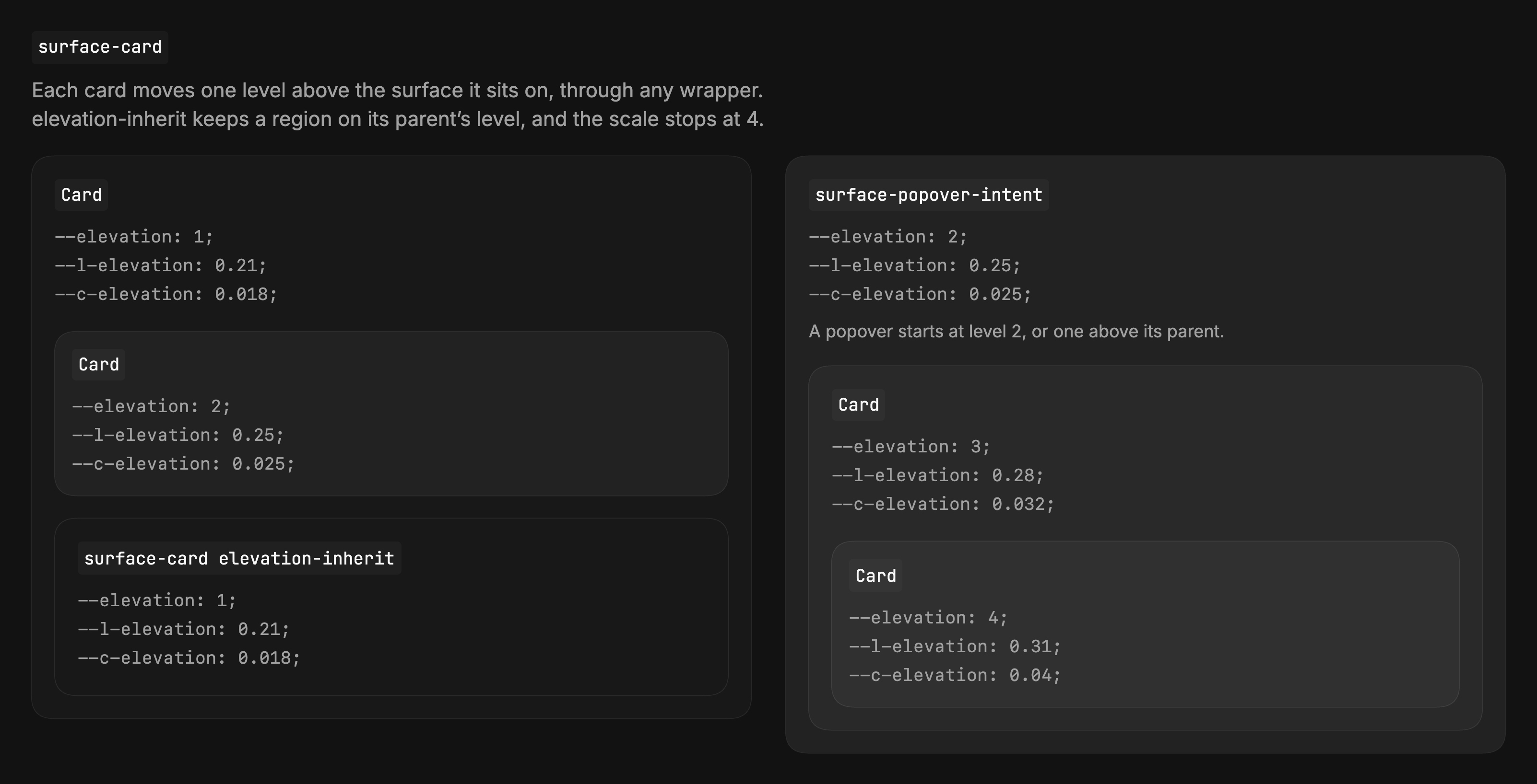
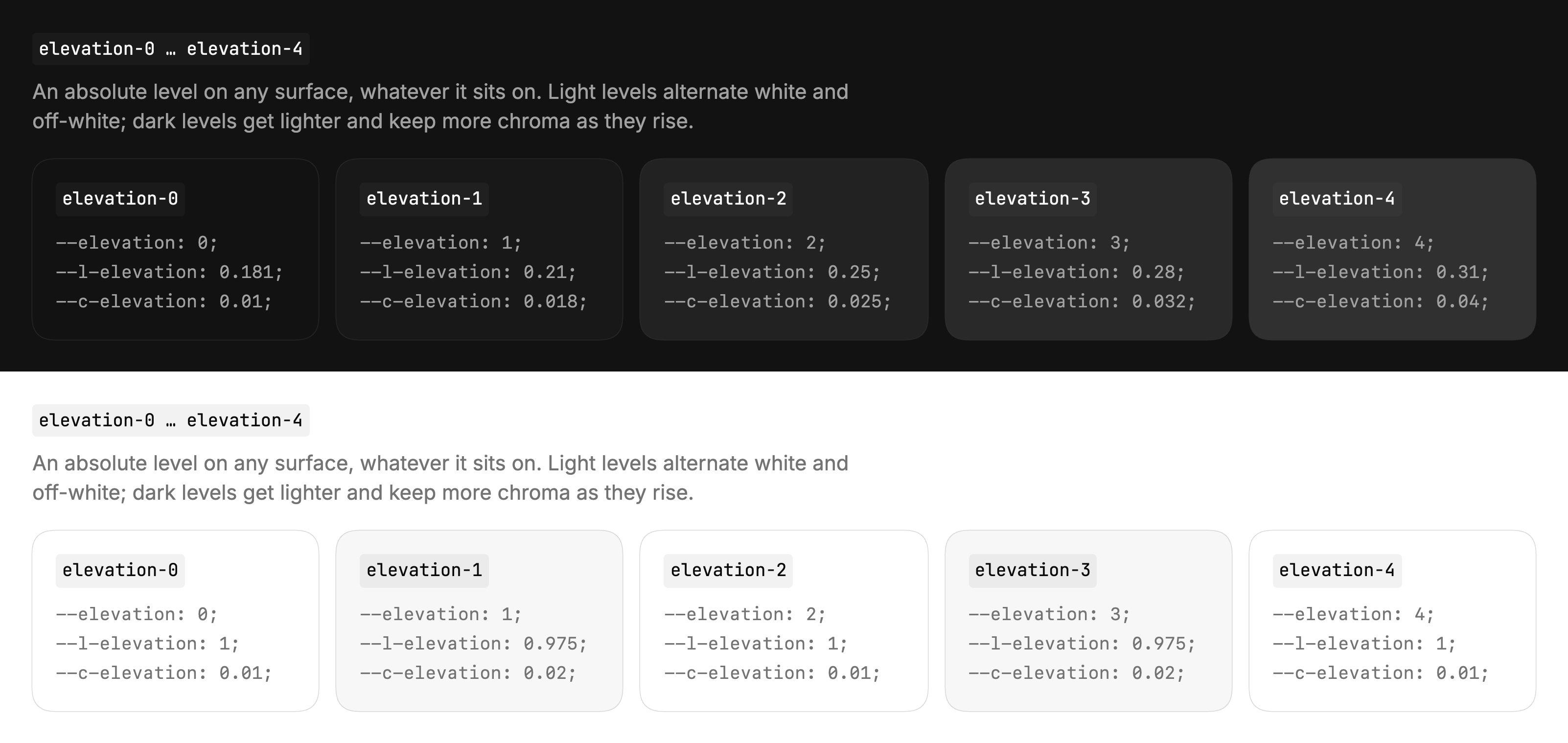
Each level picks a lightness and a chroma limit, and the intent supplies the hue. The chroma limit came from looking: with one constant for every level, the lowest surfaces were too saturated and the highest looked washed out, so I asked for chroma to follow elevation too. Dark surfaces get lighter as they rise; light surfaces alternate white and off-white. Fields paint one step above the surface they sit on, so a form looks right on a page, a card or a popover without a separate variant.
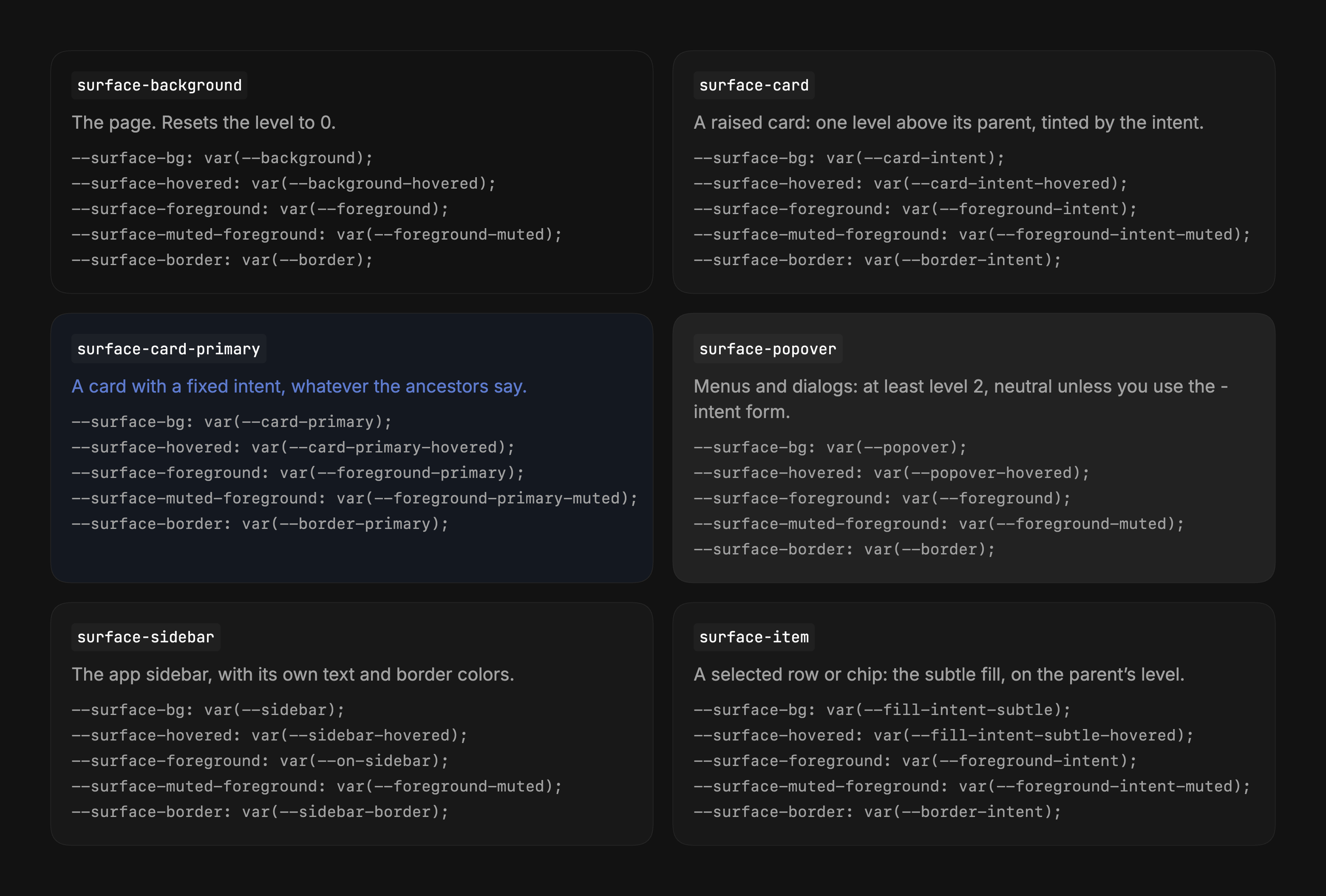
All of it hangs on one class. A surface-* preset works out its level, paints the background and hands everything inside roles for the hover, the text, the muted text and the border. A card inside a dialog comes out one level above the dialog, and a dropdown opened from that card lands above both, without anyone overriding a background or a border.
Translucent controls follow the surface too. Soft fills and outlines are see-through on purpose, which turns wrong over a photo. paint-opaque mixes each translucent fill with the surface underneath through color-mix, so the control turns opaque and looks exactly as it did; paint-opaque-border does the same for bare edges.
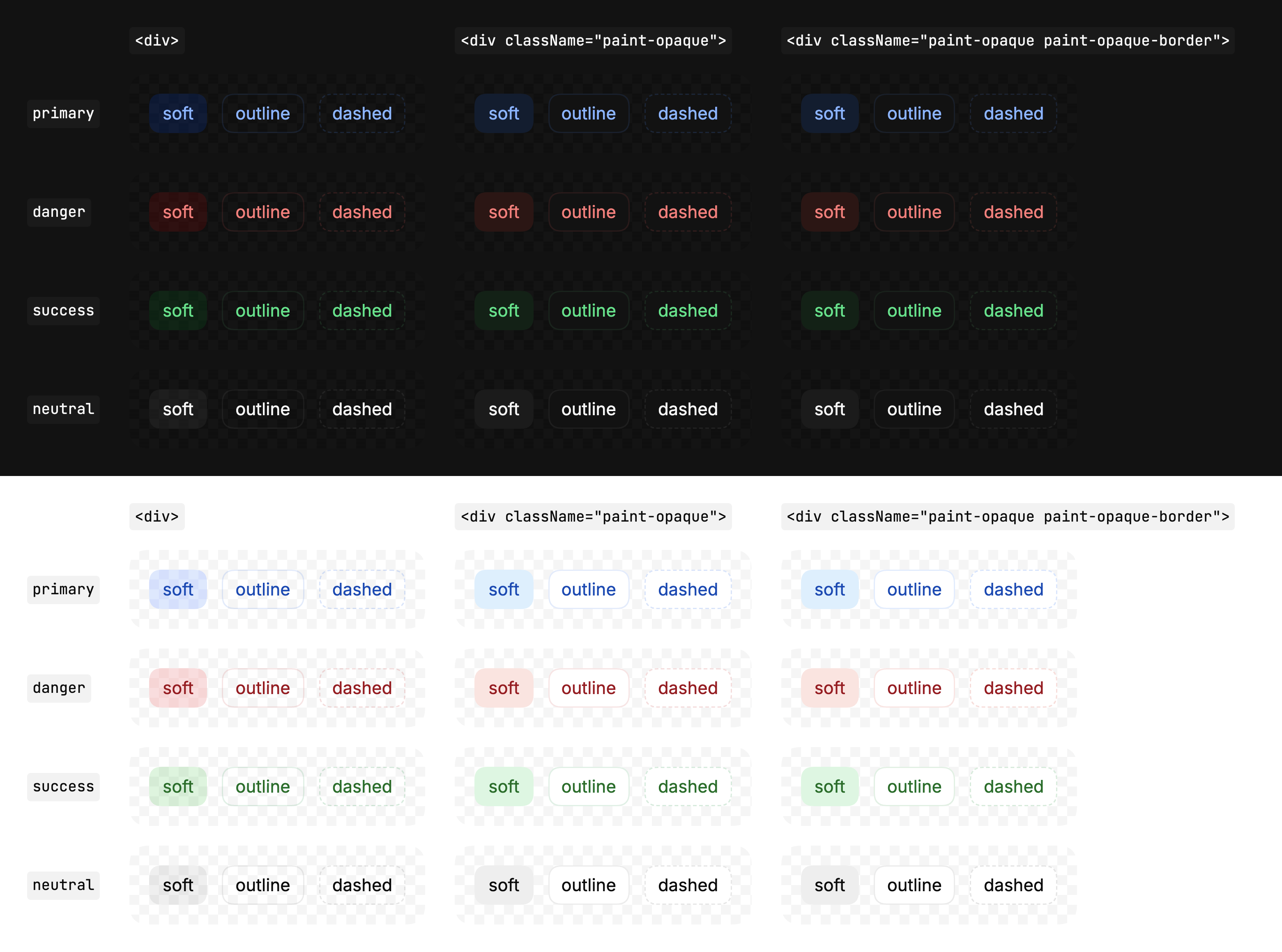
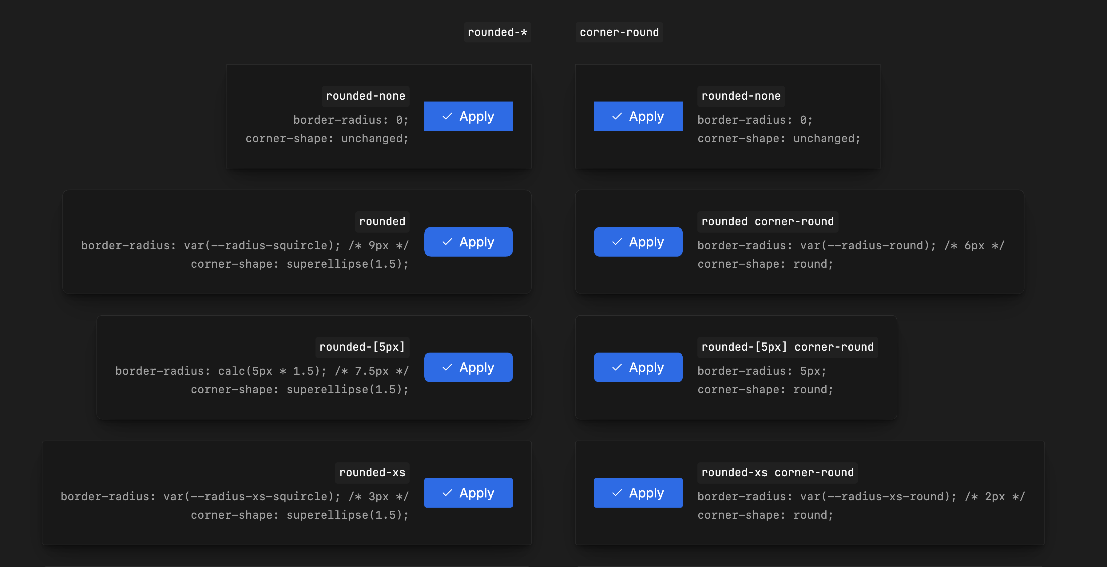
The edges are computed as well. Each shadow stacks eight layers on eased curves, after Tobias Ahlin’s layered shadows and Philipp Brumm’s generator, behind a half-pixel hairline in the intent’s border color. Corners are superellipses, scaled by 1.5 to read as the same size as a round corner, which is what a browser without support gets.
The interaction adapts, not only the layout
Responsive design usually changes the container. In Sid-Kit the interaction model itself adapts to the input and the space. AdaptiveSurface renders one feature body as a popover, dialog, sheet, docked panel or sticky column on desktop, and as a drawer or sheet on a phone, switching on viewport width, touch input or its own container’s width rather than guessing device categories.
AdaptiveMenu does the same for actions. One list of entries drives a trigger menu, a context menu and a touch drawer. On desktop, submenus fly out. On touch, nested levels become a navigation stack: each level keeps its scroll position, focus returns to the control that opened the level, and the back gesture closes a level instead of leaving the page. A touchscreen laptop never swaps an open drawer for a dropdown: the presentation is chosen when the menu opens. In the demo, open the Share submenu or try the keyboard; on a touch device the menu becomes the drawer.
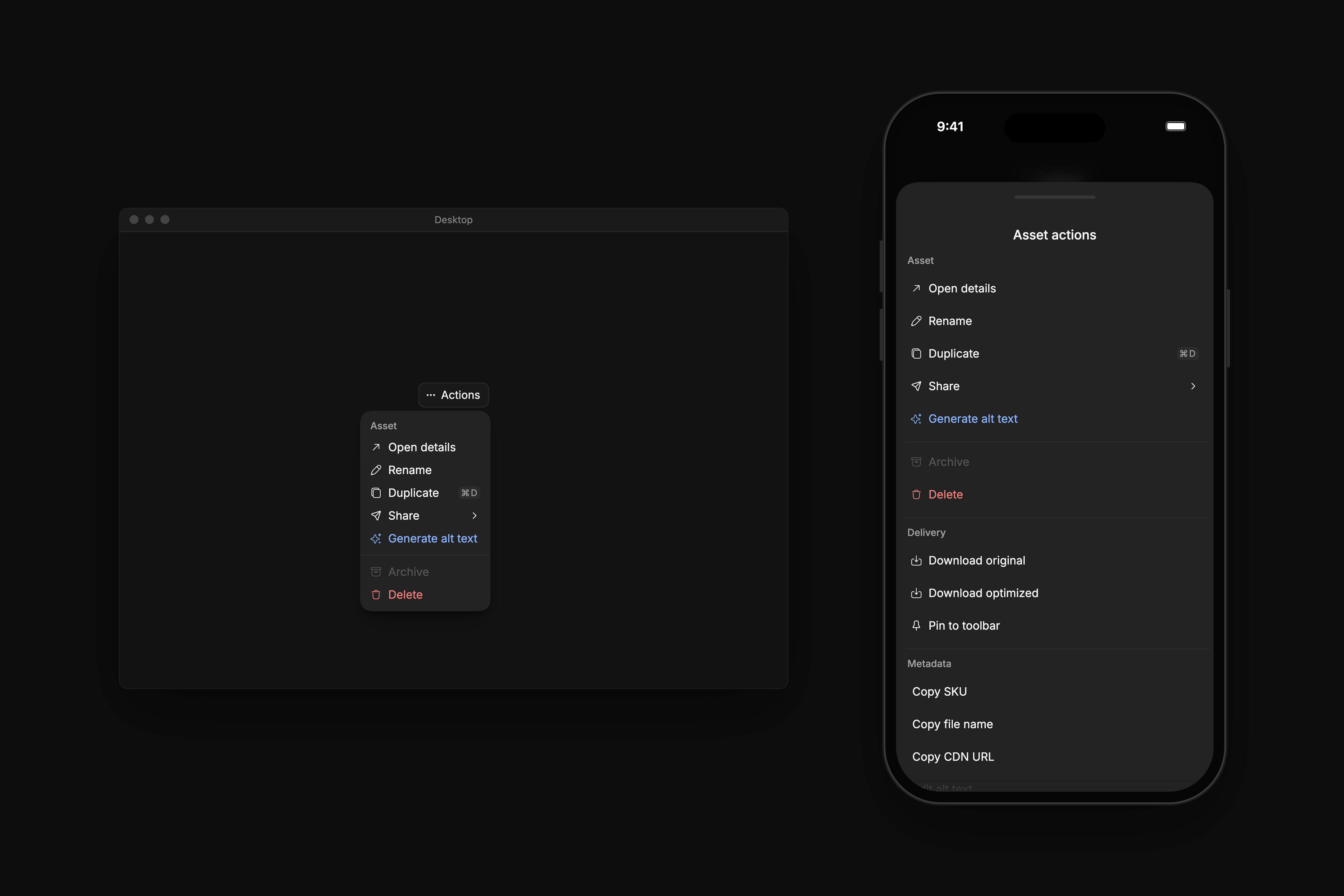
Dismissal needed precision of its own: a press outside closes the menu without activating whatever sits underneath, and Escape closes only the topmost drawer. Two races, one that closed two layers at once and one that swallowed the next press nearby, are fixed and covered by tests.
An agent’s mistake is a bug in its instructions
When an agent breaks the system, I look for the instruction that let it, because fixing the screen only fixes one screen. On 9 June a Codex agent building a dialog in Studio assembled its layout by hand: its own padding, its own body wrapper, a footer with its own border.
Something went wrong in this dialog: the header padding, the footer border. Why isn’t it canonical, like in the Storybook? How do I get you to build canonical ones, with nothing of your own?
It fixed the dialog in a minute and admitted it had bypassed the kit’s contract. I wanted to know why. Was a skill out of date? The agent said no and blamed its own priorities and a loose instruction, which it quoted: “use existing ShadCN primitives”. I asked where that line came from, since we had long been on Sid-Kit, not plain shadcn. It was in the repository’s own instructions for agents, a leftover from before the kit. When I said to go ahead, the agent replaced it within two minutes: Sid-Kit owns the composition, and its Storybook story is checked before any change in an app.
The fix that morning was one line; the lesson took the summer. By July every component had a Markdown contract of its own, rendered in Storybook for people. In September the contracts shipped with the package as a skill for the agents of every app that uses it, with an installer that fails when a project’s copy is out of date. A lint policy flags restyled components. When I noticed each project restating the same Sid-Kit rules in its own push skills, the rules moved into the kit as one push gate, enforced by a hook. After the catalog was polished for the public on 19 October, I asked for a retro on the contracts and the skill themselves.
Checks run in a real browser
A simulated DOM can’t resolve OKLCH, the cascade, real layout or pointer input, so Sid-Kit is checked in a real browser. Every story renders in headless Chromium with console-error and axe checks against a recorded baseline, and dozens of scripts test specific behavior such as menu dismissal. Before release, a packed build is installed into a temporary project outside the repository, server-rendered and built, because a component working in its own repository doesn’t prove that an app gets the same bytes.
Contrast is measured rather than assumed. Leaving it for later didn’t mean ignoring it: that night a script began checking every text-carrying pair against 4.5:1, modeling how Chromium clips out-of-gamut OKLCH. The pairs that fall short are listed rather than hidden: 52 today, 31 of them in the light theme, the lowest being text on a light info fill at 2.89:1. They are open palette decisions, and the list is a ratchet. A new pair below 4.5:1 fails the tests, a listed pair that gets worse fails, and one that reaches 4.5:1 has to come off the list.
These checks cover specific contracts and paths. They are not a claim that every combination of screen reader, device and app has been validated.
Five apps, three of them mine
Sid-Kit runs in five apps, and who chose it matters more than the count. Two are Studio’s: the server-rendered web app it was born in, and the Shopify app. On 24 May, eleven days after the kit got its name, Igor moved the Shopify app onto it on his own, which gave the system a second author and a context I hadn’t designed for. The other three are mine: both of Sparta’s apps and the editor of Straylight, my Electron app.
My own apps did most of the shaping. After my contract with Sirv ended in June, I kept developing the kit inside Sparta, with 221 commits in July and 144 in August; most of the intent cascade, the surfaces and the elevation model were built there. In September it moved into a repository of its own, and it went from 0.23 to 0.35 while Straylight was built on it. Straylight’s activity feed became a virtualized Timeline in the package, and a build quietly picking up a neighboring checkout led to pinned artifacts and an explicit refresh command.
The useful result is a place to fix behavior once: a dismissal bug or a contrast regression is repaired in the package, and every app gets the fix with its next update.
How it was built
Sid-Kit was built with coding agents. In its own repository Claude Opus 5.5 co-signed 200 of the 326 commits; inside Sparta, Claude models co-signed 151 of the 516 that touched the kit, and Codex sessions on GPT-5.5 and GPT-5.6 Sol wrote most of the rest. What the code had to obey was decided by hand: the reset, the name, the model of roles, intents and surfaces, the calls on what to break, and the eye that caught drifting names and wrong chroma. When the agents’ plans disagreed, I put them side by side; when one went wrong, I looked for the instruction behind it.
- The reset.
33 components go back to canonical shadcn in one branch.
- A package and a name.
The shared UI becomes Sid-Kit, in Studio and, the next day, in Sparta.
- A second author.
Igor moves Studio’s Shopify app onto the kit on his own.
- The dialog built by hand.
A stale line in the agents’ instructions is found and replaced.
- Inside Sparta.
The cascade, surfaces and elevation take shape.
- One specification.
A naming grammar, every color generated, 534 contexts unchanged.
- Version 0.35.2.
The catalog goes public.
- 326commits in its own repository, 200 co-signed by Claude Opus 5.5
- 516commits to the kit while it lived inside Sparta
- 771stories in the current Storybook
- 52known contrast pairs below 4.5:1, listed rather than hidden
Explore the full catalog: Sid-Kit Storybook. The densest component built on Sid-Kit has a case of its own. Read the Data Grid case study.